The final version of my on-line portfolio has been posted at:
http://www2.esc.edu/adrexler/portfolio/index.html
Below is a summary of the project.
DESCRIPTION - My final project is an on-line portfolio completely coded by me in HTML and CSS. Both the HTML and CSS code pass the W3C validation tests. In addition, the works posted in this portfolio were created by me.
TARGET AUDIENCE - The intent of creating this portfolio site, beyond as a final project for this course, was to have a selection of my graphics available to potential clients to review in order to see the range of skill I bring to a graphic assignment.
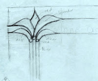
SKETCHES - Attached is my sketch of the current layout of the portfolio site banner. Other original work is posted on the portfolio "Source Images" page.
COMPUTER PROGRAMS - I used Adobe Photoshop, Adobe Illustrator, Adobe Dreamweaver, Hypersnap, Notepad and Epson scanning software to create the portfolio site and the images contained within.
ETHICAL / SOCIALLY RESPONSIBLE CONSIDERATIONS - All images/graphics were created by me unless otherwise specified on the portfolio site. I have completely eliminated all non-original sources except where it was not feasible. All attributions are listed for the images that were obtained elsewhere and I have permission to use these images. I have obtained specific permission to use the tree drawing by Charles Drexler, photos by Dave Sheldon, Marleah MacDougal and Betsy Joseph and the business card and sketch from Kerry Cordero. NASA provides permission to use their images including on personal web pages. The Japan Aerospace Exploration Administration allows use of their images for educational purposes. EMI (the recording company for Division Bell album) allows use of their images for personal, non-commercial use.
OTHER NOTES - I have made several modifications to my on-line portfolio since the previous version including decreasing the size of the small images, redesigning the banner logo and moving all the source images to another page. For my redesign of the banner logo, I kept with the Art Deco look, but chose a flower motif I sketched (attached above) and rendered first in Illustrator using the pen tool. I completed the design in Photoshop.
Many of the images in the portfolio are created from multiple sources including up to 4 background images blended into the composition. Unless specified otherwise, all these background images were also created by me. I have not attached all these background images on the portfolio site, but a selection of these are attached below.
I created this seamless background used in the Angry Crow sign from a photograph of cracked pavement.
I created this "grunge" background used in the image of Betsy from a combination of a photo of aged/yellowed paper and of corroded metal plus watercolor brush work done in Photoshop.
I created this scratchy "grunge" background used in the image of my mom starting with a scan of the bottom of one of my cooking pots.
I created this swirl background used in the first image of Phoebe from Illustrator lines imported into Photoshop where they were rotated, superimposed over dark blue rendered clouds then liquified with the bloat, swirl and pinch tools.
Monday, April 23, 2012
Friday, April 13, 2012
Creative Proposal - Preliminary - Round 2
I have made several updates to my final project, an online portfolio for my graphics and
web design. Below is a link to the updated, but still draft site.
http://www2.esc.edu/adrexler/portfolio/portfolio.html
I have made the following updates:
http://www2.esc.edu/adrexler/portfolio/portfolio.html
I have made the following updates:
- I changed the coding to add a medium size file for each image.
- I have updated/clarified the attributions for any image where it was not feasible to eliminate the part of the image that was not mine.
- I modified several images where I could eliminate non-original sources. I have only one image left which I still need to reworks.
- The text descriptions have been updated. Although they are terse, I think I will leave them like this.
- Even with the medium size images, the site still loads more slowly that I would like, so I may still split the site into a couple linked pages - maybe by moving move the source (original) images to a separate page.
- I hope to develop a couple more images to add to the site.
- Although I like the current layout, I will be trying other possible designs.
Friday, April 6, 2012
Creative Proposal - Preliminary work
My project involves setting up an online portfolio for my graphics and web design. Many graphics displays utilize Flash or Javascript, but since there are devices which cannot show Flash or have Javascript disabled, I decided to attempt to design an attractive, functional site that uses only HTML and CSS. Most of my work so far has been in the coding of the site and saving appropriate sized versions of the graphics. Below is a link to a draft site.
http://www2.esc.edu/adrexler/portfolio/portfolio.html
There are still many things I need to address including:
http://www2.esc.edu/adrexler/portfolio/portfolio.html
There are still many things I need to address including:
- The site loads slowly due to the large number of images. I plan to change the coding and add a medium size file for each image. I will probably split the site into a couple linked pages - maybe by moving move the source (original) images to a separate page.
- Several files use sources that are not mine. Where I can rework the image with items that I created, I will do so. In several cases, that is not feasible. In these situations, I will include clear attributions.
- The text descriptions are very much in draft form and need a lot of work.
- I hope to develop several more images to add to the site.
- Although I like the current layout, I will be trying other possible designs
Friday, March 23, 2012
Design Competition - Final (2 entries)
Please note, I will copy/paste some of the information provided below in postings for the preliminary work for the sake of completeness of this final submission. The first version of the poster is unchanged from Round 2. The second version of the poster has been modified substantially.
I decided to design a music poster for the 2012 Adobe Design Achievement Awards
print communications competition. I used my photo of Charlie (CHUCK) on guitar and created two versions of the music poster.
For the first version of the poster one uses the photo with two blended overlays, a texture created in Photoshop along with a random radial gradient. I created a feathered mask using the pen tool in the path mode for the texture layers. These layers were set to color burn and normal blending, respectively. I retouched the photo including removing blemishes, toning down the white of the sweater and removing a distracting element inside the guitar. I added two sets of lettering, each with several effects.
For the second version of the poster, I used the same image of Chuck. I used three overlayed photos of mine for background images and converted the image of Chuck to a high-contrast mask. One of the background images was set on exclusion blending, one on hard mix, while the third was on difference blending. I decided any border would detract from the image. I also opted for very simplified text, since the design was already visually complex.
Since the 2012 Adobe Design Achievement Awards requires an artist statement or description of the piece of 100 words or less, I have provided write up below which can go with either version of the
poster. Although the two versions of the poster are very different from
each other in style, I feel they accomplish the same design goal.
Please note - the story of Chuck is made up, although Chuck (Charles) is
his real name and he does play guitar. While the rest of the story
below is fictitious, it describes the my intended message and mood I was
striving for in the posters.
-------------------------------------------------------------------------
original photo |
Version 1 of 2 |
For the second version of the poster, I used the same image of Chuck. I used three overlayed photos of mine for background images and converted the image of Chuck to a high-contrast mask. One of the background images was set on exclusion blending, one on hard mix, while the third was on difference blending. I decided any border would detract from the image. I also opted for very simplified text, since the design was already visually complex.
Version 2 of 2 |
"My good friend Chuck is a regular feature on Friday nights at the Oasis Grill. His music has an unexpected, yet intimately familiar quality. He is a thoughtful solo performer who intersperses his own poetic compositions with carefully selected and innovative covers of classic reggae, rock and instrumental rhythm and blues. I wanted to create a poster worthy of his complex and creative musical spirit - a poster evocative of the swirling interwoven threads of imagery I enjoy in his music. I also hope that this poster will help Chuck draw the audience he deserves. Rock on, Chuck!"
Thursday, March 15, 2012
Design Competition Preliminary - Round 2
I have worked on my original design by adding and modifying the typography, adding a random radial gradient, fine tuning the masking, by adding a border and revising the photo (removing blemishes, toning down the white of the sweater and removing a distracting label(?) inside the guitar). I think this version of the poster is probably done.
In the mean time, I used the same image of Chuck for another version of the poster. For this one, I used two overlayed photos of mine for background images and converted the image of Chuck to a high-contrast mask. One of the background images was on normal blending, while the other was on color burn. I decided any border would detract from the image. I also opted for very simplified text, since the image was complex.
As mentioned in my previous post, these posters are intended for the 2012 Adobe Design Achievement Awards, which requires an artist statement or description of the piece of 100 words or less. Below is my draft write up which can go with either version of the poster. Although the two versions of the poster are very different from each other in style, I feel they accomplish the same design goal. Please note - the story of Chuck is made up, although Chuck (Charles) is his real name and he does play guitar. While the rest of the story below is fictitious, it describes the my intended message and mood I was striving for in the posters.
"My good friend Chuck is a regular feature on Friday nights at the Oasis Grill. His music has an unexpected, yet intimately familiar quality. He is a thoughtful solo performer who intersperses his own poetic compositions with carefully selected and innovative covers of classic reggae, rock and instrumental rhythm and blues. I wanted to create a poster worthy of his complex and creative musical spirit - a poster evocative of the swirling interwoven threads of imagery I enjoy in his music. I also hope that this poster will help Chuck draw the audience he deserves. Rock on, Chuck!"
Friday, March 9, 2012
Design Competition - preliminary
Wednesday, February 29, 2012
Final album redesign plus CD
This is my final album cover redesign and I added the CD design.
For the cover, I continued in Photoshop to clean up edges of several elements, cropped in closer, added a bevel to the faces which added a highlight in keeping with the shadows, added an overlay and increased the saturation of the colors in the eyes. I tried mesh gradient tool in Illustrator for the faces, but clearly this was not going to give me the look I wanted.
For the CD design, I used Illustrator for many of the elements including the text on path and live trace for the face. In Photoshop, I masked off the bleed area so you can see the Amstore template below.
What a fun project this was!!
Subscribe to:
Posts
(
Atom
)