Friday, March 23, 2012

Design Competition - Final (2 entries)

Please note, I will copy/paste some of the information provided below in postings for the preliminary work for the sake of completeness of this final submission.  The first version of the poster is unchanged from Round 2.  The second version of the poster has been modified substantially.

-------------------------------------------------------------------------

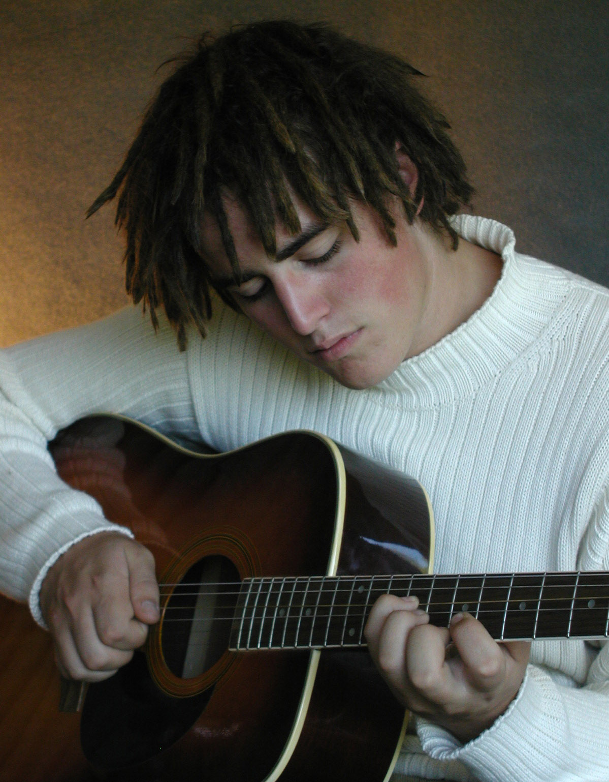
original photo
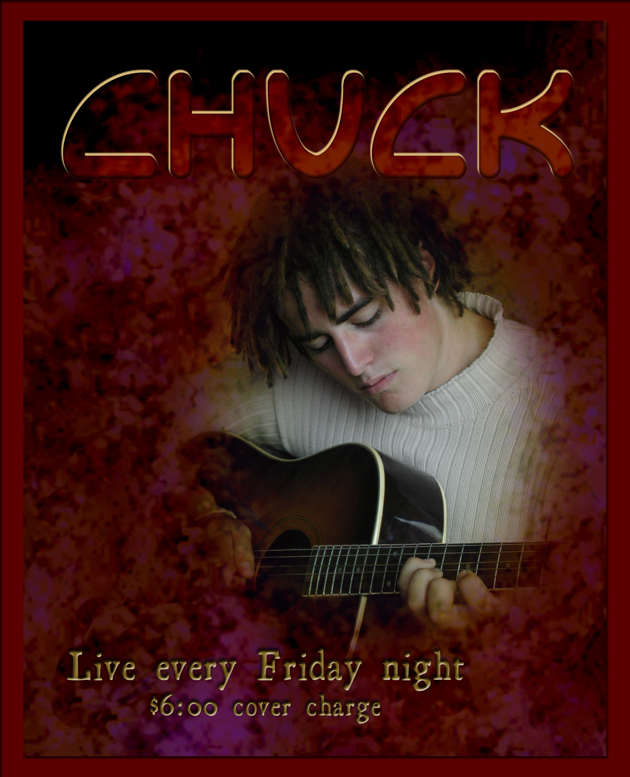
I decided to design a music poster for the 2012 Adobe Design Achievement Awards print communications competition.  I used my photo of Charlie (CHUCK) on guitar and created two versions of the music poster.

Version 1 of 2
For the first version of the poster one uses the photo with two blended overlays, a texture created in Photoshop along with a random radial gradient.  I created a feathered mask using the pen tool in the path mode for the texture layers.  These layers were set to color burn and normal blending, respectively.  I retouched the photo including removing blemishes, toning down the white of the sweater and removing a distracting element inside the guitar. I added two sets of lettering, each with several effects.

For the second version of the poster, I used the same image of Chuck. I used three overlayed photos of mine for background images and converted the image of Chuck to a high-contrast mask.  One of the background images was set on exclusion blending, one on hard mix, while the third was on difference blending.  I decided any border would detract from the image.  I also opted for very simplified text, since the design was already visually complex.

Version 2 of 2
Since the 2012 Adobe Design Achievement Awards requires an artist statement or description of the piece of 100 words or less, I have provided write up below which can go with either version of the poster. Although the two versions of the poster are very different from each other in style, I feel they accomplish the same design goal.  Please note - the story of Chuck is made up, although Chuck (Charles) is his real name and he does play guitar. While the rest of the story below is fictitious, it describes the my intended message and mood I was striving for in the posters.


"My good friend Chuck is a regular feature on Friday nights at the Oasis Grill.  His music has an unexpected, yet intimately familiar quality. He is a thoughtful solo performer who intersperses his own poetic compositions with carefully selected and innovative covers of classic reggae, rock and instrumental rhythm and blues.  I wanted to create a poster worthy of his complex and creative musical spirit - a poster evocative of the swirling interwoven threads of imagery I enjoy in his music. I also hope that this poster will help Chuck draw the audience he deserves.  Rock on, Chuck!"

Thursday, March 15, 2012

Design Competition Preliminary - Round 2


I have worked on my original design by adding and modifying the typography, adding a random radial gradient, fine tuning the masking, by adding a border and revising the photo (removing blemishes, toning down the white of the sweater and removing a distracting label(?) inside the guitar).  I think this version of the poster is probably done. 

In the mean time, I used the same image of Chuck for another version of the poster.  For this one, I used two overlayed photos of mine for background images and converted the image of Chuck to a high-contrast mask.  One of the background images was on normal blending, while the other was on color burn.  I decided any border would detract from the image.  I also opted for very simplified text, since the image was complex.


As mentioned in my previous post, these posters are intended for the 2012 Adobe Design Achievement Awards, which requires an artist statement or description of the piece of 100 words or less.  Below is my draft write up which can go with either version of the poster. Although the two versions of the poster are very different from each other in style, I feel they accomplish the same design goal.  Please note - the story of Chuck is made up, although Chuck (Charles) is his real name and he does play guitar. While the rest of the story below is fictitious, it describes the my intended message and mood I was striving for in the posters.

"My good friend Chuck is a regular feature on Friday nights at the Oasis Grill.  His music has an unexpected, yet intimately familiar quality. He is a thoughtful solo performer who intersperses his own poetic compositions with carefully selected and innovative covers of classic reggae, rock and instrumental rhythm and blues.  I wanted to create a poster worthy of his complex and creative musical spirit - a poster evocative of the swirling interwoven threads of imagery I enjoy in his music. I also hope that this poster will help Chuck draw the audience he deserves.  Rock on, Chuck!"

Friday, March 9, 2012

Design Competition - preliminary

I decided to design a music poster for the 2012 Adobe Design Achievement Awards print communications competition.  Here is my preliminary work.  My general concept is to use my photo of Charlie (CHUCK) on guitar with some texture(s) and that riveted metal look to the text.  I will try some different layouts, textures and color overlays before I am done. Below is my original picture and the texture I created in Photoshop.


Wednesday, February 29, 2012

Final album redesign plus CD

This is my final album cover redesign and I added the CD design.


For the cover, I continued in Photoshop to clean up edges of several elements, cropped in closer, added a bevel to the faces which added a highlight in keeping with the shadows, added an overlay and increased the saturation of the colors in the eyes.  I tried mesh gradient tool in Illustrator for the faces, but clearly this was not going to give me the look I wanted.

For the CD design, I used Illustrator for many of the elements including the text on path and live trace for the face.  In Photoshop, I masked off the bleed area so you can see the Amstore template below.

What a fun project this was!!

Tuesday, February 21, 2012

Redesign of Pink Floyd's Division Bell cover

Dark Side of the Moon

Probably one of the most iconic album covers ever, is Pink Floyd's Dark Side of the Moon which was designed by Storm Thorgerson.  He also designed their cover for The Division Bell.


Pink Floyd • The Division Bell


I decided to re-design the Division Bell cover keeping in mind that the Dark Side of the Moon cover has no moon imagery whatsoever.  Bringing the moon imagery into my remake of The Division Bell seemed poetic as a link to their other album.  On a side note, these sculptures are supposedly now in the Rock and Roll Hall of Fame according to Wikipedia.


I utilized Hubble photos of stars, NASA photos of the moon and Japan Aeronautics Administration Agency photos of the earth rising over the moon horizon for my project.  I complied these into one image along with the Division Bell metal face sculptures all in Photoshop.  Here is my first draft.  Among other planned changes, I need to work on some of the component edges.  I am going to try recreating the faces with the gradient mesh tool.  If I like them better, I will do a swap.  I would also like to design the CD label.  Stay tuned.  Here is my interim version.


Friday, February 17, 2012

Revised Illustrator project

I moved/flipped/resized components and reworked some shading and texture.  At Heather's suggestion, I have moved the logo and text together allowing for the right side to expand appropriately to serve as a website header/banner.  I agree that they belong together (thanks).  I think it works better.

Tuesday, February 7, 2012

Illustrator Rework Project

I imagined that I have a client (Sandhill Cottages) that needs a website and they want me to use the following low-res image to create their website logo.  It is from a Google search which turned up this Wikipedia image of a dusky dolphin. 


I used the warp and pen tools Illustrator to trace the dolphin, used an artistic brush for the water, recolored the brush strokes and then applied special effects to both the dolphin and water.  I kept them in separate layers for better control.  Below is my reworked image from Illustrator.


I imported this Illustrator file to Photoshop to add the text and frame and a background gradient.  Here is my initial "final" image.